|
A blog post following my dissertation research journey.
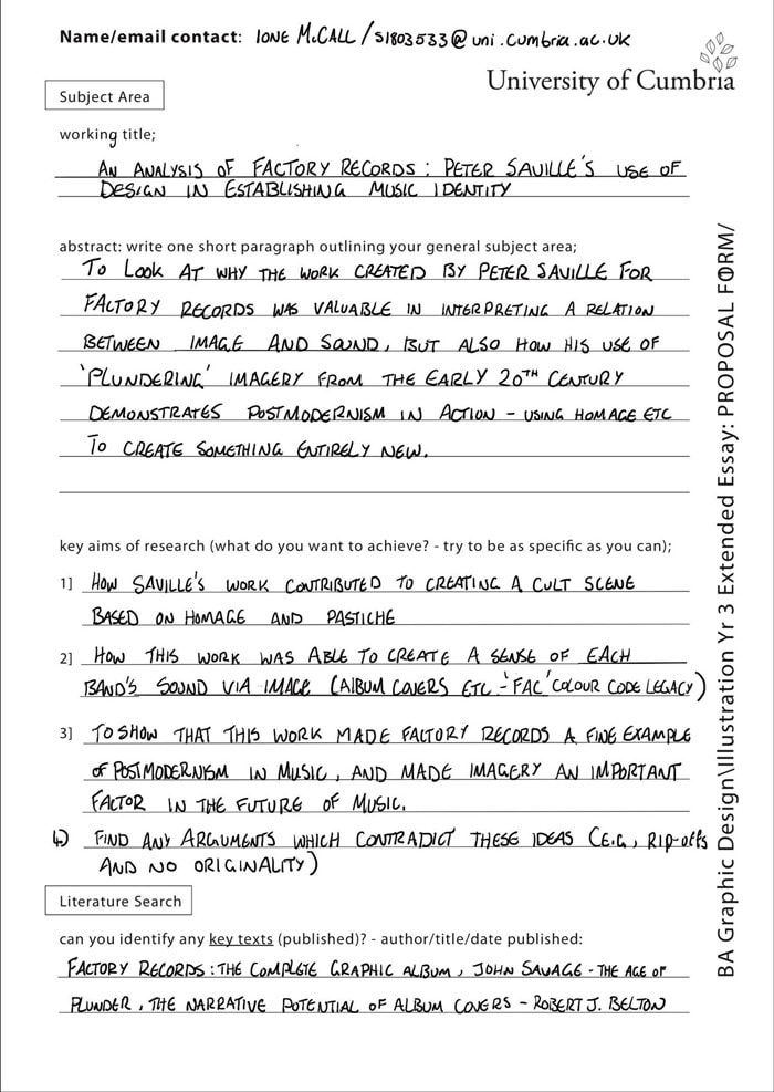
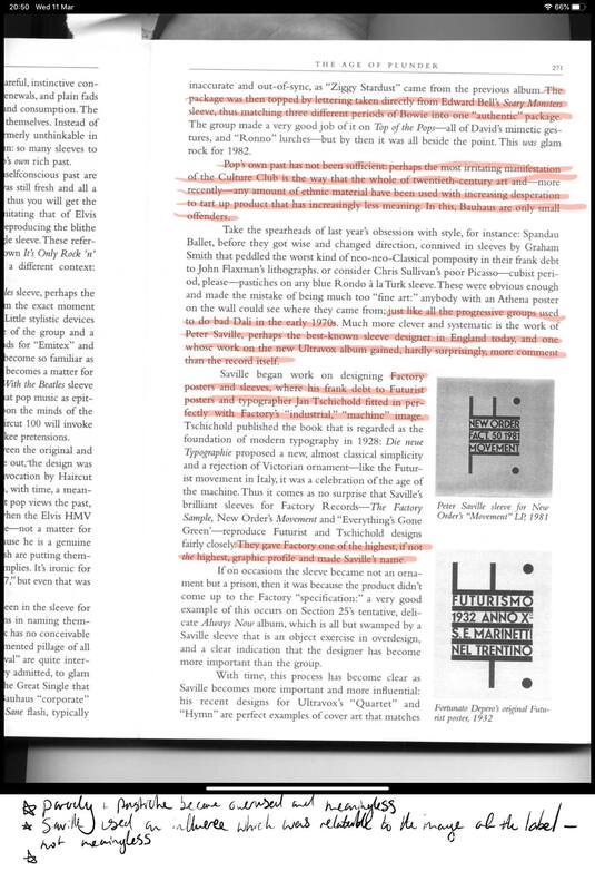
Above is my proposal form for this year's dissertation. I'll be focussing on Manchester graphic designer Peter Saville and his role in factory records. Previously I was going to look at Art vs Crafts and how activities like domestic crafts are not looked upon as high art. While this is an interesting subject i felt that discussing art work from Factory Records was a little closer to home for me interests wise.
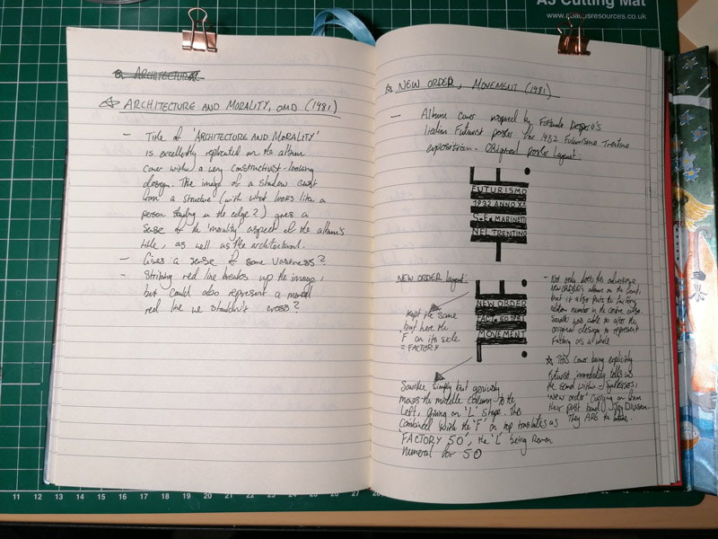
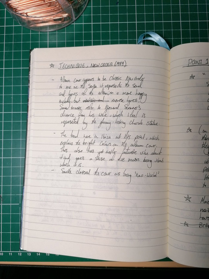
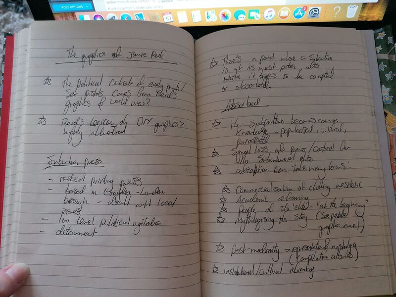
Above are some notes collated from various sources, an analysis of some album covers and post modernism/cultural identity. Info from articles/interviews, journals, documentaries.
Sources
0 Comments
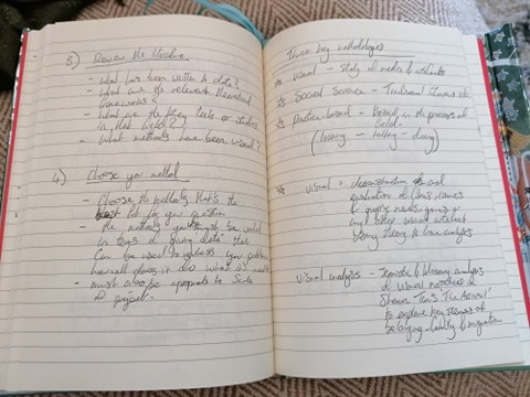
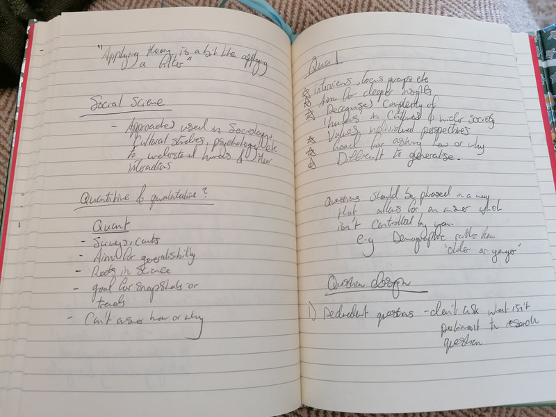
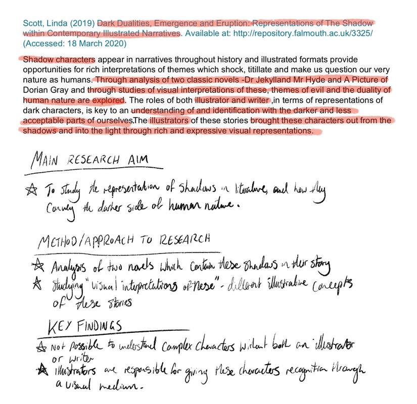
This week's blog is about 'The Research Journey' - planning and researching for a written piece of academic writing. Research is a very valuable part of the essay writing process and should be rigorous and thorough. Without enough research it would prove difficult to write a cohesive and in-depth piece of work. Below are some notes from the lecture on this: Below is an analysis of an article abstract, given to pick apart and identify the article's research aims, conducted methods of research and key findings for the writing. References
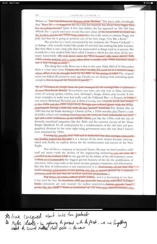
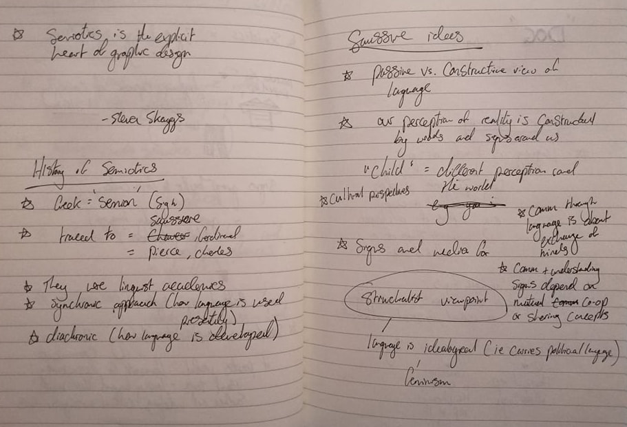
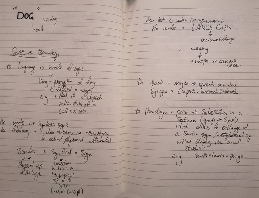
Scott, L. (2019) Dark Dualities, Emergence and Eruption: Representations of the Shadow with Contemporary Illustrative Narrative. Available at: http://repository.falmouth.ac.uk/3325/ (Accessed 27 April 2020) This week was an investigation into the world of Post-Modernism and visual culture, explaining what the key visual features of this term are and wether or not we are really living in a post-modern society. The period we refer to as post-modern dates from 1980-the present day, and is something we are still in the process of defining. Some key terms that have been discussed include: After Modernism: The idea modernism is over, there is a compendium of knowledge on the subject and it now has a place in history where it can be studied (in conclusion, we are in a Post-Modern era). Anti-Modernism: The theory that aspects of modernism have failed, and there is no universal truth (we live within a society based on post-truth culture) Hyper-Modernism: Modernism has not run its course and it is still ongoing, and is cyclical (seen in conjunction with post-modernity). The idea that we live in a post-internet culture rather than just a post-modern one. Features of different visual cultures found within Post-Modernism can be found below in the lecture notes: Extra reading analysis notes: Jon Savage, "The Age of Plunder" References
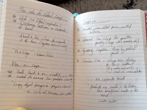
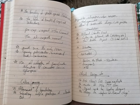
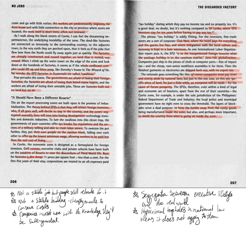
Savage, J. (1983) 'The Age of Plunder', the Face (January) pp 45-49 This week we learned about Globalisation - the act of communities and cultures being interconnected via improved communication on a global scale. An example of how globalisation has become such a prevalent thing is the rise of the internet, as this allows us to view other cultures and vice versa, creating a thing called 'cultural hybridity' - the mixing of certain cultures to create a new sub-culture or category, or even the clashing of those cultures. There are 3 key themes that link into Globalisation, which are the Global Village, digital integration, and trade without borders. These are explained below in my notes from the lecture. Extra reading analysis notes: "No Logo", Naomi Klein Klein, N. (2005) No Logo. London: Harper Perennial
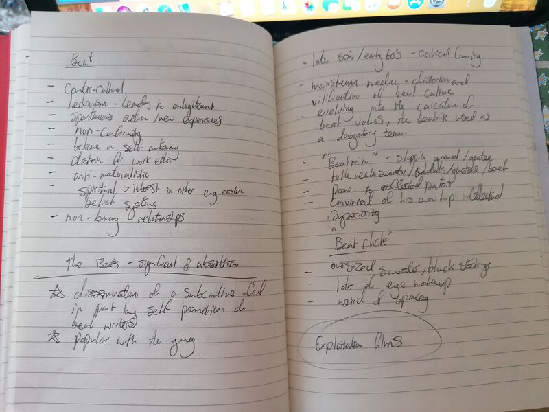
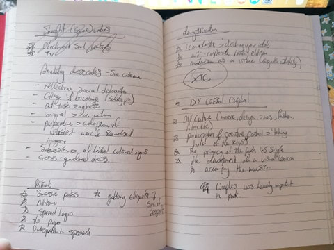
This week our case study was that of subcultures: minority groups which go against the beliefs and values/lifestyle of mainstream culture (i.e an organised society, a 'Dominant Culture'). In its most rudimentary form, the description of a subculture precurses the definition we know today as a subculture, which describes the sort of 'youth in revolt', post-1945 social groups. The original dates back to the 1800s, but was first studied by the sociology department of the Chicago School in the 1920s, who looked to how these 'deviant' groups evolved via societal problems (Grinnell College, 2019). According to Hebdige (1979, p.17) when a subculture raises its head it means there is "break down of consensus" within mainstream culture. To understand this we looked at the Beat Generation of the 1950s/1960s, and the Punk movement of the late 1970s. Despite this more common knowledge term to define a subculture, Doehst et al (2015, p.1) believe that studies conducted in the 60s and 70s on subcultures can easily be criticised. This is because they "romanticised elements like style, group identity and political resistance, and because it almost exclusively addressed the cultural practices of male western youth". Instead, they argue that the definition of subculture should be redefined for the 21st Century, and must look at "studying the cultures of various social groups, which are intertwined with one another and with global mass culture". Because of this definition, I will be looking at a more modern subculture. VAPORWAVE Fig 1 - Floral Shoppe, Macintosh Plus (2011) Fig 1 - Floral Shoppe, Macintosh Plus (2011) Vaporwave is subculture which was born on the internet in the 2010s, therefore accessible on a global scale. It was born out of a short-lived music genre called Chillwave which came to prominence around 2008/2009 (although, the two terms have been used interchangeably) which involved artists such as John Maus, Washed Out, Ariel Pink and Geneva Jacuzzi. Chillwave was full of retro-sounding, analog recordings and melodies. Both are a culture which embraces a nostalgia for the 1980s/1990s, but Vaporwave was able to create something entirely new out of it (Meme Music - An Abridged History of Vaporwave, 2019) - almost a parody, even. A lot of Vaporwave music consists of tracks by popular musicians of the 1980s which have been slowed down and reconstructed to create a new piece of music (What Happened to Vaporwave?, 2016) In 2011 Macintosh Plus released their album Floral Shoppe, which almost immediately became a meme on the internet. The album cover for Floral Shoppe (Fig 1) has a bright pink background, a marble classical art greek bust, and a retro-looking cityscape with Japanese writing above it. If you are into your Vaporwave, you will know that everything I have just said is the most Vaporwave-sounding stereotype there is. The internet has not only managed to create a meme, but ironically gave way to a whole new genre of music which has now come full circle to being 'memed' once again. Other parts of Vaporwave culture include: making grainy TV-like images (usually with tones of pink or purple), taking modern items and giving them the retro treatment (Holmes 2015 - see 80s style VHS tapes of modern shows) and also making merchandise with cultural icons which we relate with nostalgia (search Y2K fashion). Another aspect of Vaporwave is film (however this could be deemed as a kind of exploitation to some extent). In 2015, a Swedish filmmaker called David Sandberg created a hybrid of Miami Vice and the Karate kid (plus a whole lot more) to create KUNG FURY: an LA cop who has the gift of superhuman martial arts abilities and must travel through time to stop the ferocious Kung Führer (Adolf Hitler). The film pays homage to not only the two aforementioned iconic 1980s shows, but also Knight rider and Street Fighter/Mortal Combat/Tekkin. With the film being the first ever film to be made via kickstarter, it brought the attention of Vaporwave more to the mainstream - and with its countless nods to stereotypical 80s style, became a kind of exploitation film. Another film which has its roots in Vaporwave is Turbo Kid, which is less known but still has all the signs of a retro influence in it. With Vaporwave now being taken into a mainstream habitat, its influence can be heard in the music of Mac Demarco, Alvvays, and has also spawned sub genres like 'Simpsonswave' and ' A E S T H E T I C' culture. Probably at the moment its biggest influence can be found on the Netflix series Stranger Things. Below are some Vaporwave curios:
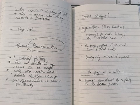
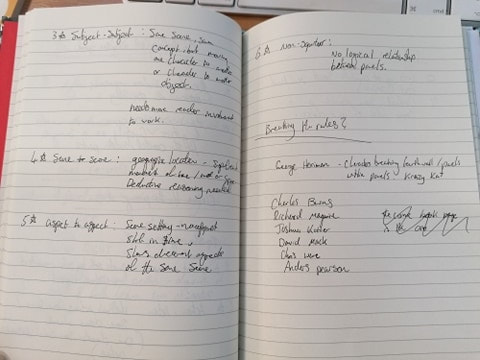
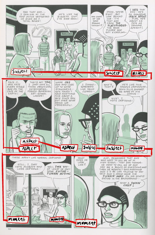
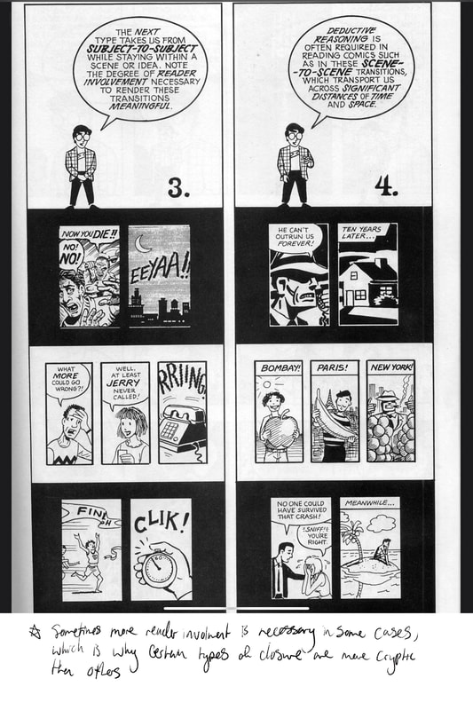
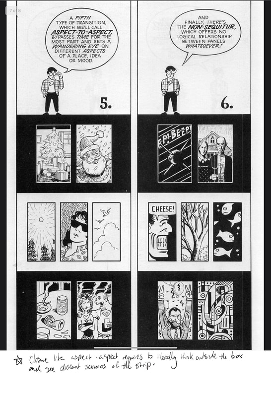
A Simpsonswave Playlist References a e s t h e t i c s (2015) MACINTOSH PLUS - FLORAL SHOPPE - 02 リサフランク420 - 現代のコンピュー (30 December) Available at: https://www.youtube.com/watch?v=bAgmGZ9iQ2Y (Accessed: 27 April 2020) Electronic Gems (2014) HOME - Resonance (16 July) Available at: https://www.youtube.com/watch?v=8GW6sLrK40k (accessed 27 April 2020) Epic Pictures Group (2015) TURBO KID - Official Release Trailer [HD] (16 June) Available at https://www.youtube.com/watch?v=AFlZ6pVtnv0 (Accessed 27 April 2020) Holmes, K. Modern Films and Tv Shows Get Recreated as Retro VHS Tapes (2015). Available at: https://www.vice.com/en_uk/article/vvy34x/modern-films-and-tv-shows-get-recreated-as-retro-vhs-tapes (Accessed: 27 April 2020) lafemmelily (2017) alvvays - not my baby (11 September) Available at: https://www.youtube.com/watch?v=d5jW4LkfHTA (Accessed 27 April 2020) LaserUnicorns (2015) KUNG FURY Official Movie [HD] (28 May) Available at:https://www.youtube.com/watch?v=bS5P_LAqiVg (Accessed: 27 April 2020) Lucien Hughes (2016) S I M P S O N W A V E (8 February) Available at: https://www.youtube.com/playlist?list=PLwXZJ72PzThfKWr3oajYaHId3GjF2XSh1 (Accessed 27 April 2020) Fig 1 - Macintosh Plus (2011) [Record Cover] Available at: https://www.banquetrecords.com/macintosh-plus/floral-shoppe/OESB92 (Accessed: 27 April 2020) Meme Music - An Abridged History of Vaporwave (2019). Available at: https://www.dailytargum.com/article/2019/10/the-history-of-vaporwave (Accessed: 27 April 2020) newjerseyjustin (2014) Mac DeMarco - Chamber of Reflection (10 March) Available at: https://www.youtube.com/watch?v=NY8IS0ssnXQ (Accessed: 27 April 2020) Stranger Things (2016) Stranger Things | Title Sequence [HD] | Netflix (26 Nov) Available at: https://www.youtube.com/watch?v=2LQD1OOb-Us (Accessed 27 April 2020) theSUPREMEscene (2012) DIANNA ROSS it's your move (26 June) Available at: https://www.youtube.com/watch?v=Uno7f5IGAPI (Accessed 27 April 2020) What Happened to Vaporwave? (2016) Available at:https://www.esquire.com/entertainment/music/a47793/what-happened-to-vaporwave/ (Accessed: 25 April 2020) This week we were looking at the graphic code of comic books and how comic artists use this code, or signs, to create a visual story. This is a code unique to comics which is generally easier to understand, and is understood better by the reader. Our given task is to look at a comic artists and interpret their work with the learned material above. I've decided to go for Daniel Clowes and his cult comic Ghost World (2000); the story follows two girls (Rebecca and Enid) who are on the cusp on adulthood and start to realise that maybe their friendship isn't as stable as it once was. I've always been a fan of coming-of-age stories, so naturally this is what intrigued me to read the comic. I found it quite surprising that - given the colourful cover - Ghost world is entirely a 3-colour comic (two colours if you discount the white of the paper). I feel like this is maybe meant to represent that, although, your teenage years are supposed to be the kind of rebellious and most colourful years of your life, some aspects of coming into adulthood are actually quite bleak since there's a lot of emotional and difficult times throughout. Clowes' use of black, white, and a pale minty-green make this idea seem all the more valid since there's no vibrancy at all. The comic mostly follows the 9 panel grid layout with some exceptions of those panels becoming a couple of larger ones, or an interestingly shaped one etc. Page 15 of the book displays this excellently as we see the top row containing the title of the comic which then extends down the lefthand side of the page, setting the scene of the next chapter. Even though this is quite a unique looking panel arrangement, it does follow the standard order of direction for following a comic: eye hits top left of page (which draws our eye down the length of the panel), eye then hits middle of the page (we hit the middle panel searching for the continuation of the story which is above it), and eye then finally follows down to the bottom right of the page where it ends. The pictorial flow of the page is not just dependent on the layout but also the transition from panel to panel. Types of transition (McCloud,1993 p.70-73) are: subject-subject (same scene/concept, moving character to character or character to object) moment-moment (panels side by side, moments of time have elapsed) action-action(different actions, same scene, some closure ahead) scene-scene (geographic location - notable change of time and/or space, deductive reasoning needed) aspect-aspect (same setting, no apparent shift in time, shows different aspects of the same scene) An example of these transitions can be found below on this example of an analysis of page 26, where Rebecca and Enid are discussing love interests. The part I find most interesting about this page is that for the aspect-aspect transition, Clowes uses the person of their conversion on the phone to show that the scene is taking place in a public space and there are other people present going about their lives - a different aspect of the scene. It's not just solely about Enid and Rebecca's conversation, but what's going on around them. Comics don't necessarily have to follow a strict plot thats exclusively between two people, or a group of people, or one person - they need to show that there is an atmosphere surrounding the story in order to convey the particular sense of emotion or feeling the author is trying to get at. Extra reading: analysis of comic book closure, Scott McCloud (2000, p.70-75) References
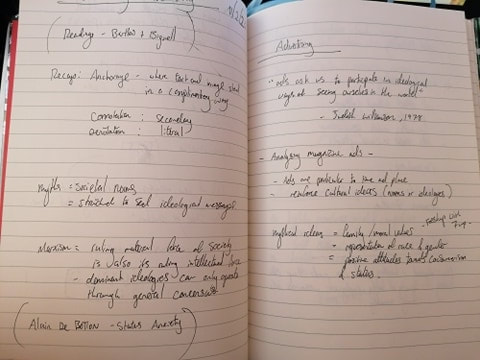
Fig 1 - Clowes, D. (2000) Ghost World, Jonathan Cape, Random House, p.15 and p.26 McCloud, S. (1993) Understanding Comics. Northampton: Tundra Publishing This week we were looking at decoding advertisements and how ads are particular to time and place as well as good methods for reinforcing cultural ideas/cultural norms. Examples of this include ideas of family values, representation of race and gender, and also positive attitudes towards consumerism and status. We examined two advertisements below denotatively and connotatively to see their messages. Some notes from the lecture on decoding advertising, in accordance to the magazine ads above. The next task required us to research or own advert and decode it. For this I've chosen a McDonald's ad (or rather one ad in three parts), which can be found below (Fig 1). Denotatively, the ad simply gives us directions. Pretending we are someone who does not know anything about McDonald's or what they are, all we can gather from this are a series of shapes, instructions and colours. Looking closer, if we apply the directions to the shapes we can clearly see that the shapes become a road. The first panel says "next exit" and gives us a split line which reads as a fork in the road, therefore we can tell that this is a sign which would be displayed to drivers on a busy motorway. The second panel gives us the instruction "on your right", indicating to take the right hand side exit. The third panel displays "just missed us" with a yellow arch. If these shapes are roads then this is a clear indicator that the driver must take a U-turn because they've traveled too far up the road.
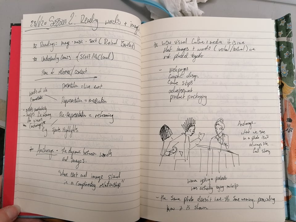
Colour wise, the red and yellow used on the advert are rather vivid. This is a good choice if it wants to stand out to drivers. The colours are also very warm and therefore inviting to the eye, making the person who sees it want to pull over and take the directions shown on the sign. Warm and inviting colours usually indicate comfort, and when driving on a busy road for a while most people seek a break and a comfortable sit down. This is also normally associated with a food break. Now that we now the sign is an indicator for the viewer to take some rest and recuperation, we can gather that is most likely an advert for a fast food restaurant (most probably fast food since it's at a road side). Because McDonald's and other fast food joints are so ingrained in our culture and seen in our everyday lives, the ultimate conclusion is that this is an advert for McDonald's. If you'd never seen McDonalds then you'd only be able to know this once you got to the destination, as the only conclusion you could draw from this advert is that it is a fast food joint. References Cosette. (2018) Follow the Arches. Available at: https://www.adsoftheworld.com/media/outdoor/mcdonalds_follow_the_arches(Accessed: 27 April 2020) This week we looked at the different ways in which we can read words and images. Key points which were covered in a recap of the aforementioned post The World of Wrestling include: Frame of Reference - Presentation: live event Representation: mediation. e.g words of the sports commentator Re-representation: reframing e.g sports highlights We also looked at: Anchorage - The dynamic between words and images - Where text and image stand in a complimentary relationship (Types of anchorage include: Word Specific, Image Specific, Dual Message, Interdependent/Convergent, and Parallel or divergent.) Today we analysed the piece of work A Treachery of Images by René Magritte and how it can be read as a polysemous work (Barthes, 1977, p.15-p.27) i.e open to many interpretations. These interpretations can be Denotative (literal reading or non-coded, what we immediately see in the image) and Connotative (coded reading, or where words and images trigger associative readings or links to other concepts). References
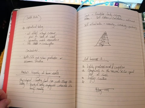
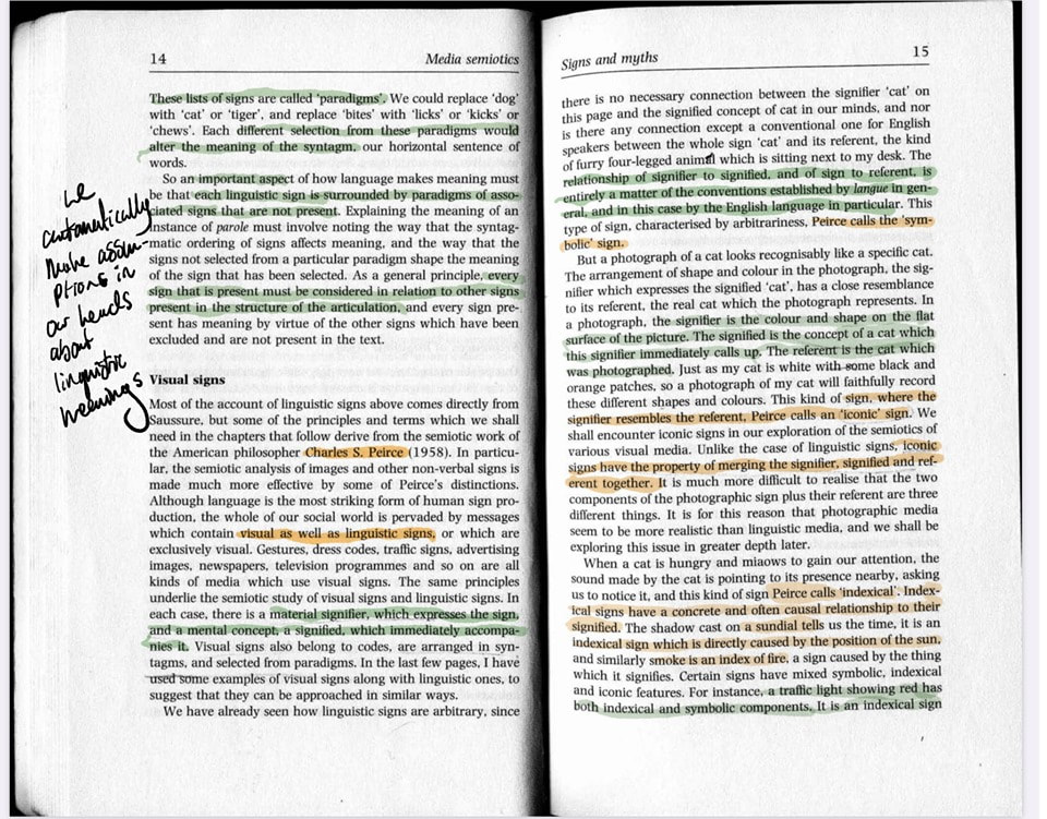
Barthes, R. (1977) The Photographic Message. In: Barthes, R. Image, Music, Text. 1st Ed. London: Harper Collins. p.15-p.27 The World of Wrestling This week was the introductory lesson of our essay module and to kick it off we looked at the topic of Semiotics - more specifically, "The World of Wrestling". Given a presentation of the ideas of Barthes, Saussure, and Pierce, we analysed the spectacle of wrestling and the myths* which surround it to answer the question: "is wrestling really a sport?". *Not Mythology as we know it, e.g mythological creatures, but ways of thinking which send messages in society to propagate 'cultural stereotypes'. Notes of study below: Conclusion: Wrestling appears to convey the image of a passionate, brutal sport - but in reality it is an image fed to us by various myths within the match. These myths range from the ideas of serving justice, types of costumes worn by 'good guys' and 'bad guys', and hopeful words and actions that assign an underdog image to one opponent but a malicious one to the other. These stereotypes reinforce the way that society wants us to see certain situations. Extra Note Analysis on Bignell: Signs and Myths References
Barthes, R. Mythologies (2000) London: Vintage Books |
|
Site powered by Weebly. Managed by 34SP.com

