|
Mission: Penguin student competition 2020. This project has been taken just as an exercise, although the option to enter in Penguin Publishing's actual competition is there. I'm redesigning covers for Meera Syal's "Life Isn't Always Ha Ha Hee Hee", and David Wallace-Wells's "The Uninhabitable Earth". Left: Pinterest board of inspiration |
WARM UP
Essentially this project is a learning curve in understanding how type and illustration can work together and be compatible in different ways. For this reason we were firstly set some tasks of the different ways type can be used: type AS illustration, illustration and type working together, bastardising type (i.e taking a typeface and changing it in some way), and sourcing types that aren't already preinstalled on software e.g Helvetica, Futura etc. We were to apply these to a T-Shirt design, film poster design, book cover design and album cover design (all can be seen in the above slide show).
SELECTIONS AND DEVELOPMENT: Meera Syal
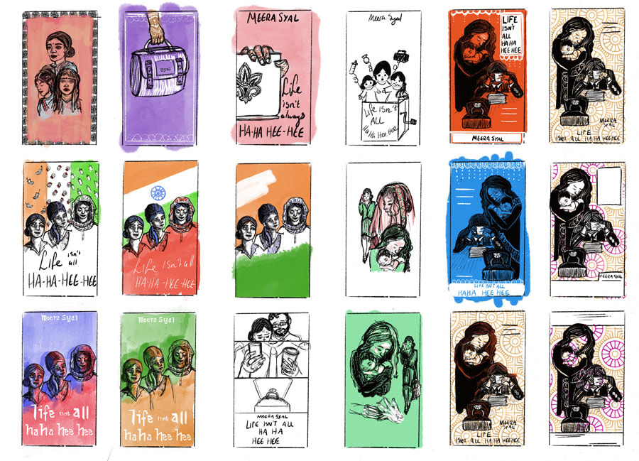
Initial thumbnails and development for the book Life isn't all Ha Ha Hee Hee by Meera Syal. As the book is about 3 Indian women living in Britain and coming to terms with their life struggles but also a clash in cultural identity, I chose to experiment with the most obvious motif and look at flag colours. The blue and red which can be seen in the first photo of thumbnails stood out the most to me, however blue and red have the connotations of police lights and I didn't want the theme to be misconstrued. Next I played with the colours of the Indian flag a little which I felt suited the book more but it sill didn't really represent enough of a clash for me. To combat this I experimented with the hue and the saturation so that the colours would become something else entirely. Also had a go at some different ways of incorporating hand-rendered type.
While I Initially liked this idea, after feedback it was clear that there had not been enough time spent on development, and it was also a fairly busy design meaning that seeing type on the back cover would be an issue. I decided to revisit doing thumbnails and went with a different design from the selection.
Played around with colours and patterns for this design.
Although I tried to incorporate some pattern in, it just was not enough. I opted to make the background patterned instead. The previous design felt too comic-like for me.
After some alterations, a full frame fit the design better
FINAL DESIGN
Final book design in orange. Pink felt a little too garish for this design, and I picked a papered texture to tone it down the orange a little more.
SELECTION AND DEVELOPMENT: David Wallace-Wells
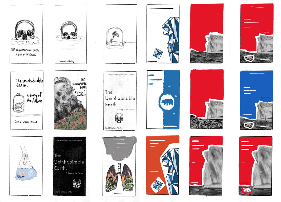
Initial thumbnails and development for the book The Uninhabitable Earth by David Wallace-Wells. The book has been regarded as an alarmist read about the troubles and damaging effects of climate change and how our future will almost certainly be worse off if we do not take action now. To display this I felt it was necessary to stick to the idea the current book jacket displays - very blunt, very straight forward, no messing around; black and white. I played with colour inversion to see which held its own more and got the message across. As it is a book on our future I felt Futura was a clichéd but also sensible font to go for with the main title (however I had also been looking at a lot of mid-century book covers and this probably explains the choice too).
As with the first book, the thumbnailing stage on this design also needed more work and refinement. I tried to think of the alarmist concept and make it even more straight to the point, so instead of just an ominous skull I went with the idea of ice caps melting and how this has an effect on wildlife as well as us.
FINAL DESIGN
In the end I decided to go with the red design rather the blue simply because it fits the tone of urgency that Wallace-Wells conveys in the book itself.


