|
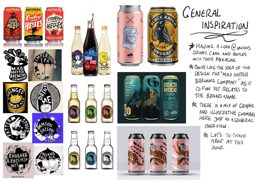
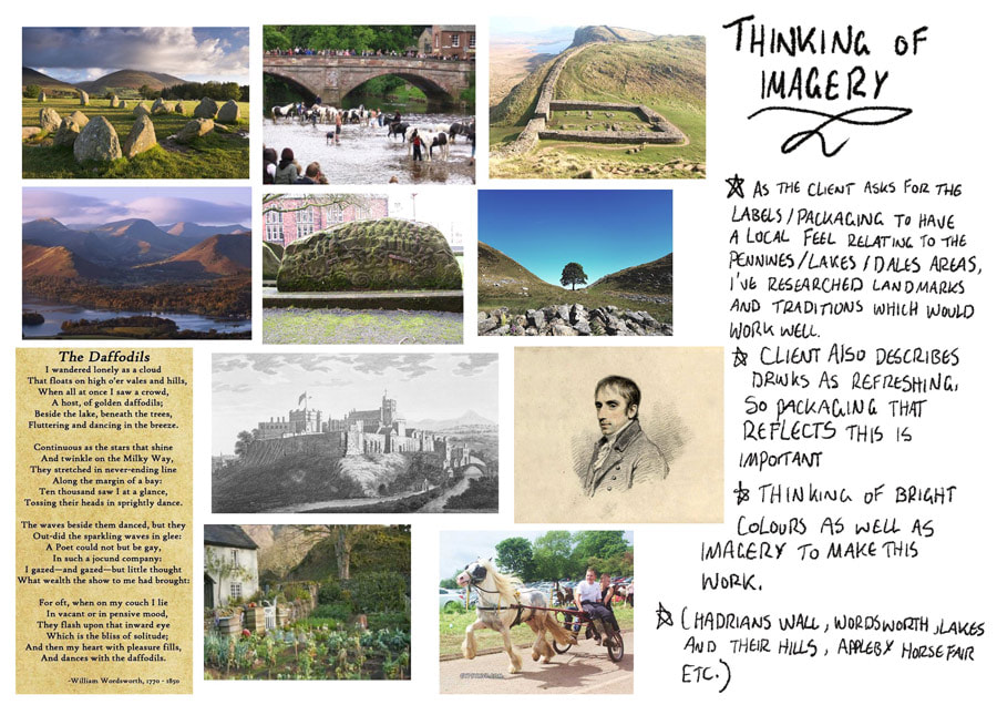
Mission: create a label for Eden River Brew Co.'s new line of soft drinks. Left -Pinterest board of inspiration This project required us to meet with the client (Jason) from Eden River and listen to his ideas on designs needed for their new soft drinks. He specified that a Northern and local feel was necessary as the company is based in Penrith. |
DEVELOPMENT
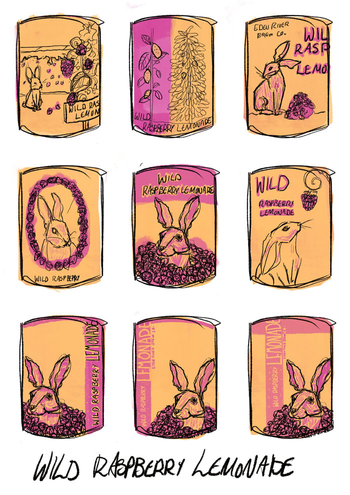
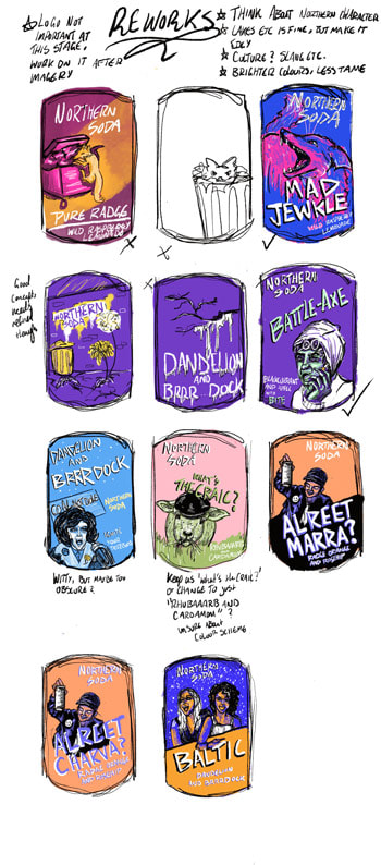
Started off with some basic ideas, however the idea of northern England and locality stuck in my head the most. After the first feedback session it was agreed that my ideas were not reflective of me, so with this I decided to draft a few newer ones and focus more on the culture of the area rather than its scenic highlights.
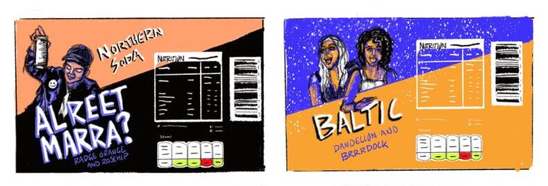
Thinking of the label as a whole, I began to do some fairly straightforward mockups.
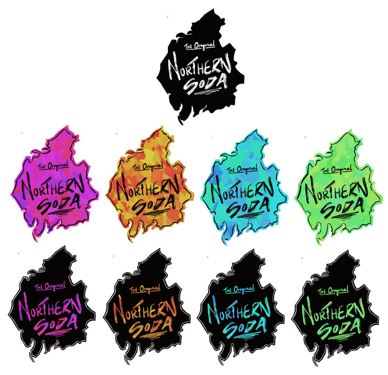
Testing out different variations of a logo style. Region of Cumbria with different colours and layering types. This did suit the overall vibe of my design however, as it made the whole style look overly busy.
PROCESS OPTIONS
|
|
|
|
|
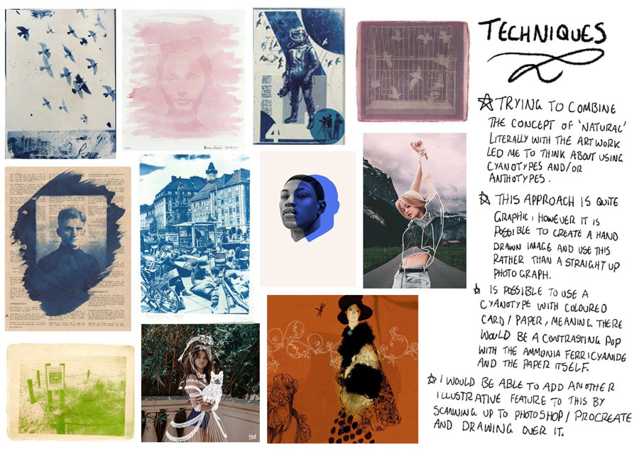
Considering my options for the look and feel of this project, I've decided to look at the effect that alternative photographic processes produce. This is because it's the closest thing that resembles the image in my head for the final piece. I do possess a cyanotype kit which contains colours other than the classic blue, however it is a limited selection; the Gum Bichromate process gives me the option of choosing any colour as the pigment required can be any water based paint like watercolours or poster paint (the more central video here shows multiple layers of the Bichromate process). I may use a mix of these processes to develop the photographic images.
STARTING ON THE FINALS
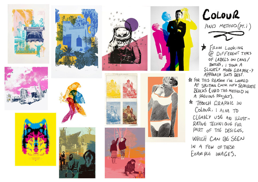
Unfortunately due to home technical issues (primarily with printers), I've been unable to go ahead with the cyanotypes in this time of Covid-19. I've had to go with a different technique for this one and go down the more silk screen-style route. I used a mix of Photoshop and Procreate for this.
FURTHER EXPERIMENTS
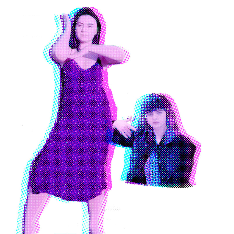
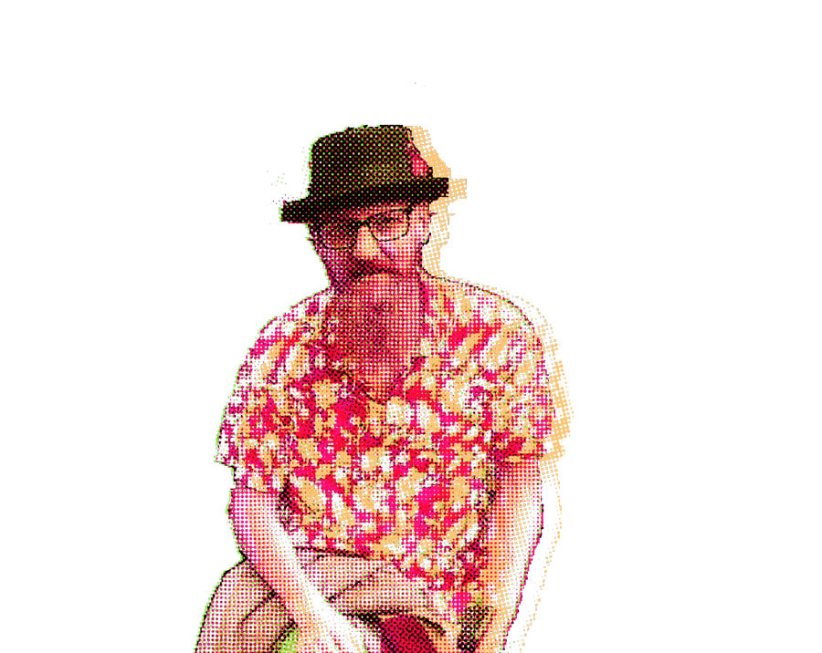
To get the more graphic effect I was aiming towards (as the above had far too much detail going on for my liking), I searched up some tutorials for colour separation on photoshop followed by a further tutorial offered by our lecturer. Playing about with this was quite fun because there were an endless number of colour combinations I could have used.
Colour separation experiments. Using photoshop I was able to get the grainy silk screen effect and also move the layers around to enhance this even more.
GRADUALLY GETTING THERE
FINAL LOOK
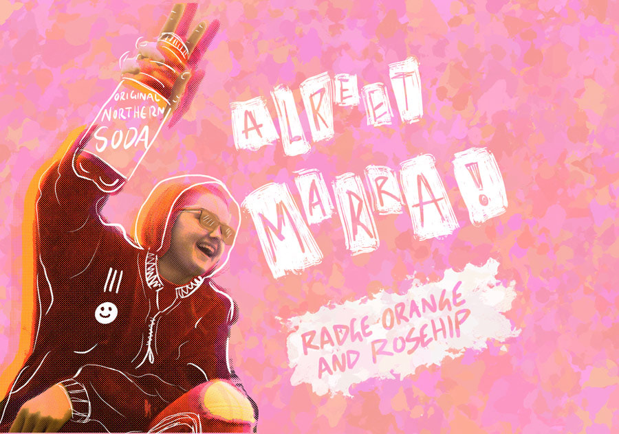
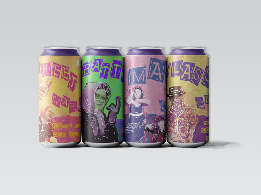
Final mockup presentations! Different views of the same can plus all cans lined up. Thoroughly happy with this final set up even though it was not my original intention to make a purely digital piece of work. However, compared to the cyanotype process (which I would've continued with if it had not been scuppered by technical issues), this version may have been the more logical way to approach the task. It also allowed me to gain more skills in photoshop by learning how to colour separate and operate in CMYK.

